


I Judge a book by a cover
Clickable Book Covers

Why? Probably, because I didn't start my writing career as a writer. I started it as an artist. Second, I don't have time to read lines and lines of book descriptions. Like most people, I can process images much faster than words. Although if your book description is boring, it might be time for me to look at another book to purchase. I also don't read most online book reviews. Frankly, I don't understand the logic. Am I supposed to trust the opinion of a person I don't even know? Do they think like me? If I know the person well and they suggest a book to me, that's something else. With an online purchase, I look at the cover, read the first few lines of the book description, and if there's a connection—I press the buy button.
Have I convinced you yet, the book cover is critical? If you have money to burn and time to wait and have Chip Kidd, Alvin Lustig, or Neil Fujita on speed dial, and can entice them to design a romance cover; You don't need to read this. I don't have any of the above. I've been shopping for book covers lately because I've written three novellas in the last four months. I'm self-publishing these books, and I'm not interested in committing more than $150.00 on each cover, hopefully less. With the first novella, I was lucky, my website manager designed the cover on the fly, and we went with it because I needed it for bookfunnel.
For the others, I’ve been shopping for pre-made covers. I’ve discovered that, sometimes, these inexpensive covers are as good as some covers the smaller publishers are providing their authors. The reason for this is that the artists are often using the same stock images and some of the artists working at these pre-made companies are very good. Unless you hire an artist to make an “original illustration” for you, you are, most often, getting cover art made from altered stock photos.
If you read the policies from the websites listed below, they only sell the pre-made cover you purchase once and then remove them. Although at a later time, they could rework it somehow and sell something similar in the same way you see a piece of the clip art used in another book cover.
I’m sure most of you realize that just because you spend five hundred dollars or more on an original cover, it’s no guarantee that the cover is clickable. Sometimes a cheaper cover will beat out a more expensive cover. Skye Warren shows this in her clickable book covers presentation. You might come across it on line during one of her workshops. It is definitely worth watching if you get a chance. She often gives this away for free, as a teaser promotion.
I don’t claim to know what makes a great book cover. Believe me, I’m still figuring it out myself. Here are some suggestions that have been offered up to me and they make sense. However, feel free to take the things that work and let go of the ones, that don’t.
#1. Meet genre expectations, but still have some element of surprise. It helps to stand out from the pack to some extent. For instance, if it’s a romance book, there are many beheaded, bare-chested men on romance book covers. There’s nothing wrong with this. But how can you communicate this genre if you’re writing sci-fi, suspense romance, or military romance? It is helpful to examine books in your genre and make notes about their design style. A gothic romance novel looks like a gothic romance novel. A rom-com romance novel looks like a rom-com novel, etc.
#2. Feature a key theme from your book. Your story should provide the “idea” for your cover. The cover should communicate, “this book is about….” consider the one thing or theme you want readers to know about your book. If you search on Amazon, you may discover that some best-selling books in your genre may not even have the male figure on them at all.
#3. How does the color factor into the theme and the reader’s selection? What if your book features a black and white color theme? Especially if the book appears in a block of books, on Book Funnel, where most of the other books are in color?
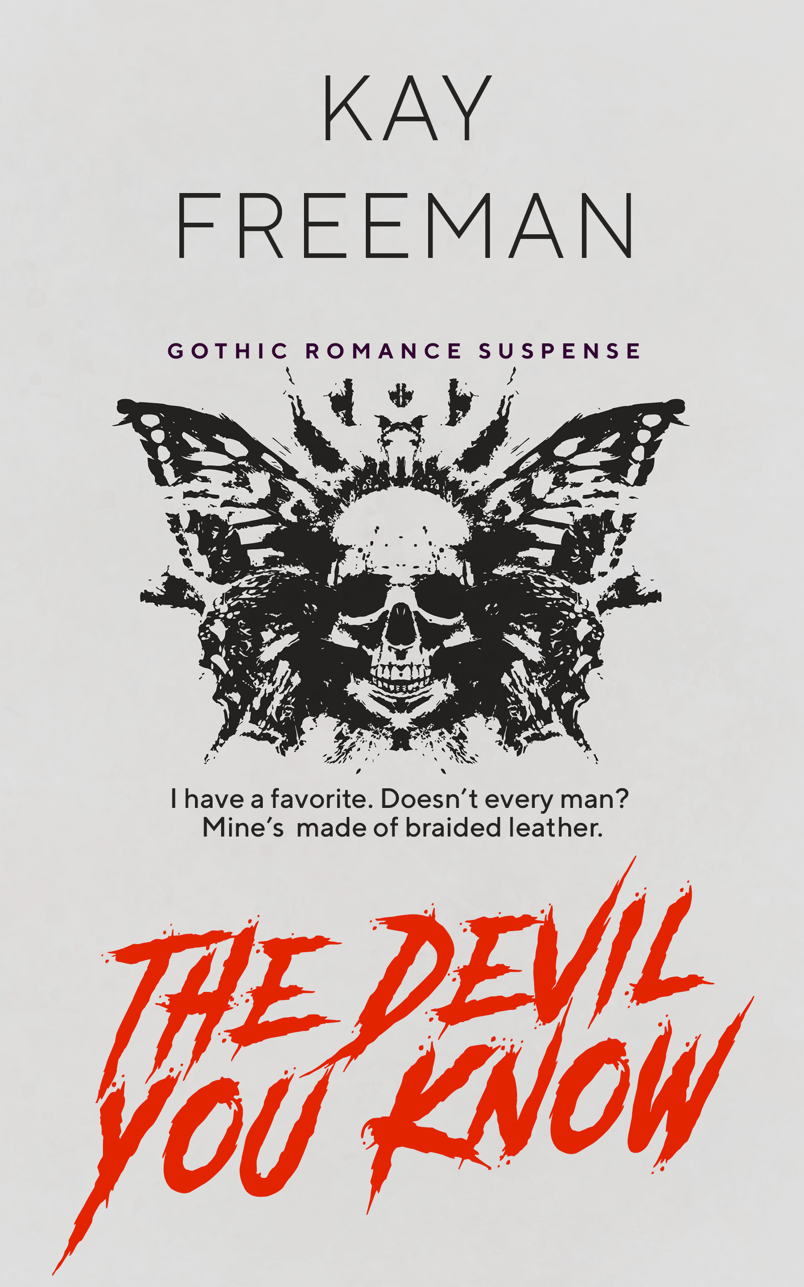
#4. Make sure the style of font expresses the title of the book. If establishing your brand is essential, make sure the color of the font of your name is in keeping with your brand (website). In my cover design above, I went against this suggestion as the fuchsia color of my logo did not jibe with what I was going for in the cover. I left my name in black. The cover above cost $85.00 for the digital-only version, which is below my budget. Do a happy dance. Also do not discount what font style alone can do. In the hands of a real designer, that alone could do all the heavy lifting. Most of the pre-made cover sites allow you to change the font style, color, size with ease. This is where you can really make the final design shine.
#5. Make your title prominent. It's best if you never have to search for the title. It needs to be the focus. Realize many people shop online now, and your book may appear tiny. Hence, the book title must be legible, even on a smaller scale. Make the font easy to read, in a color that stands out from the background and large enough to dominate on every platform (computer, laptop, iPad, phone.) Here's a helpful website to assist you in figuring out color combinations. It's suggested that you not use over three colors in your cover design to avoid confusing the reader. Serif fonts are easier to read than a san serif font. Your name can appear in a san serif font but don't use over two different fonts in your cover. If the design is cohesive in other ways, you can push the boundaries and try it. The idea is to keep things easy to read for the potential buyer.
#6. Consider a subtitle or teaser (tagline). Keep in mind that many online buyers will not read the synopsis. The subtitle or/and tagline can motivate the reader to look closer and buy the book. Make sure this info is distinct from the title.
#7. Space is important in all designs. Don’t fill everything up. Give the distinct elements of your design room to breathe.
Here are some websites that I’ve found that have reasonable pre-made covers:
Book Cover Zone (this is where I purchased the one above)
If you would like to work with an original designer, I found an exciting way to do it, crowd spring, and it's affordable. It works like this. You submit your project. Its cost $299.00. You get 40 designs and feedback from focus groups on your designs. You whittle it down to five finalists. The five finalists work on the final design, and you pick the one you want. They also accept other design work, logos, etc. I confess I have not used this company, but the work on the site looks impressive. I'm going to use them on the next project I have and I’ll report back.
If you have thoughts on purchasing book covers, especially challenges you've faced when working on a series. Some companies offer pre-mades in a series, but there is much less of a selection.
Yeah! I’m happy to report that I'm hacking twenty-five percent less than a week ago. Stay well, and have a great week.
Thank you Ellen. I think people will buy a book based on a cover. Seen it happen in book stores all the time. It doesn't mean they are happy after they read it. Ha!
Thank you for sharing so many options and for such a detailed post. I have a self published friend who is also an artist. She designs her own book covers, and I’ve seen people buy her books because of the beautiful covers.
Kudos for a great post.